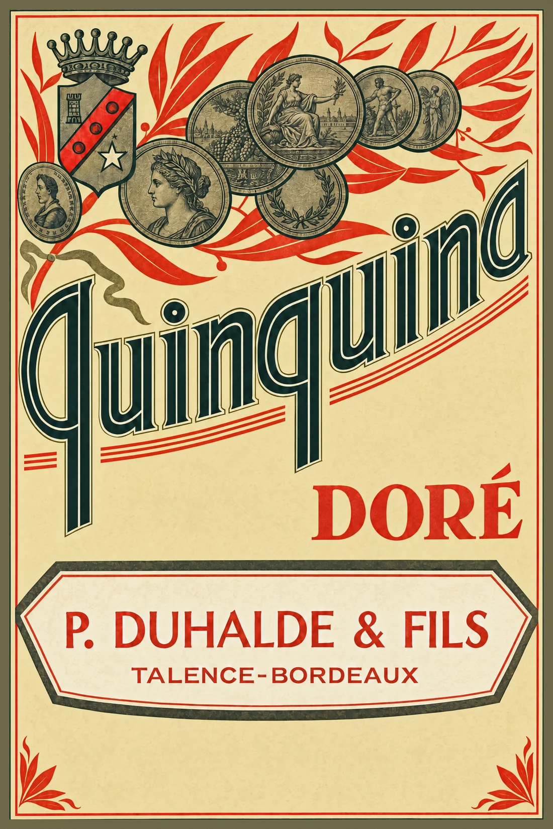
Quinquina Doré
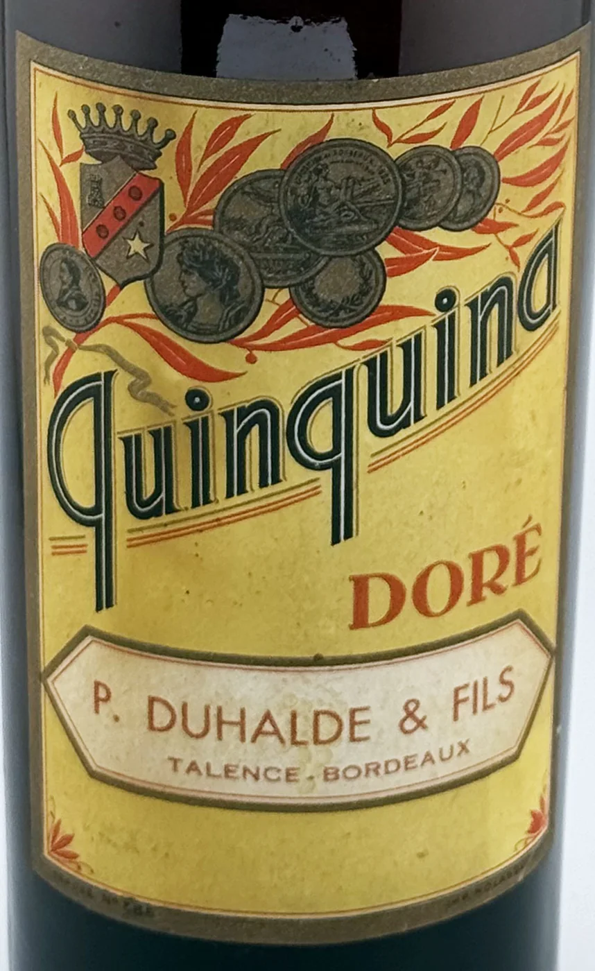
The label
- House
- P. Duhalde & Fils
- Town
- Talence
- Date
- circa 1930-1940
- Style
- Art Deco
- Printing
- 4 colours
Its distinctive traits
- Diagonal Title
The name set at an angle across the label, to catch the eye on a shelf.
- Quinquina & Cap Corse
The product category assigned in the catalogue.
- Bordeaux & South-West
Bordeaux, the port of the liqueur trade (Marie Brizard, Cazanove, Guillot), with Cognac and Jarnac, Périgueux and the walnut country.
Its story
No outside source has been found yet for this house. The label itself records P. Duhalde & Fils at Talence-Bordeaux, and a crowned shield with a tower, a red band and a white star.
Letters drawn with a white line inside. Each stroke of Quinquina is black with a fine white line running through it, and the word climbs on a slant between thin red rules. The house name sits apart in a long six-sided cartouche, red on white.
From the bottle to the print
"label":
"LL-0749",
"catalogue": 676,
"chain":
"ethereum"
}
What the label says