Kina Rok
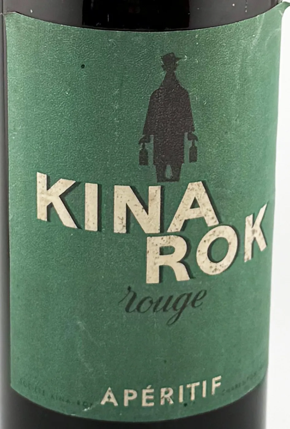
The label
- Town
- Charenton-le-Pont
- Date
- circa 1930-1940
- Style
- Mid-Century
- Printing
- 3 colours
Its distinctive traits
- Mid-Century
The graphic style assigned after reviewing the remastered label.
- Collector’s Pick
One of the collector’s favourite labels.
- Quinquina & Cap Corse
The product category assigned in the catalogue.
Its story
No outside source has been found yet. The label names the Société Kina-Rok and Charenton, on the edge of Paris.
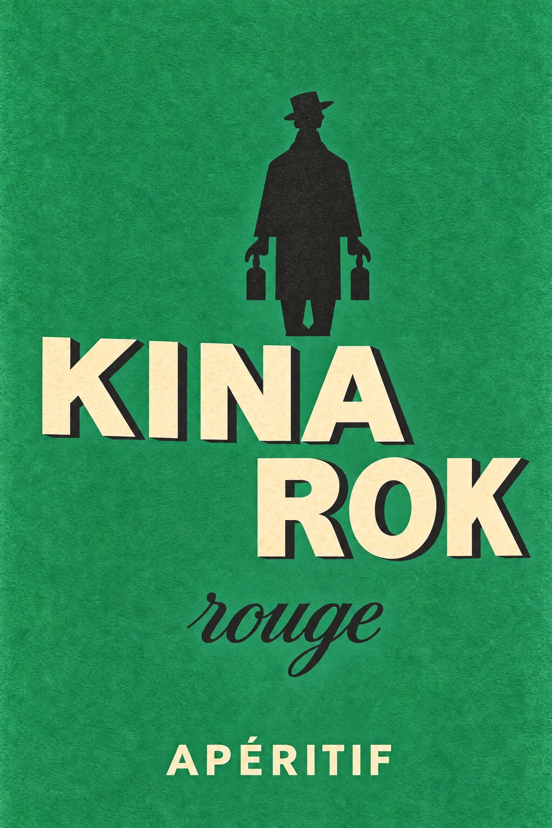
The figure is printed in a single dark tone, with no face and no detail, like a traveller seen from afar. The word rouge, in a loose script, is the only soft line on the label.
From the bottle to the print
"label":
"LL-0715",
"catalogue": 664,
"chain":
"ethereum"
}
What the label says