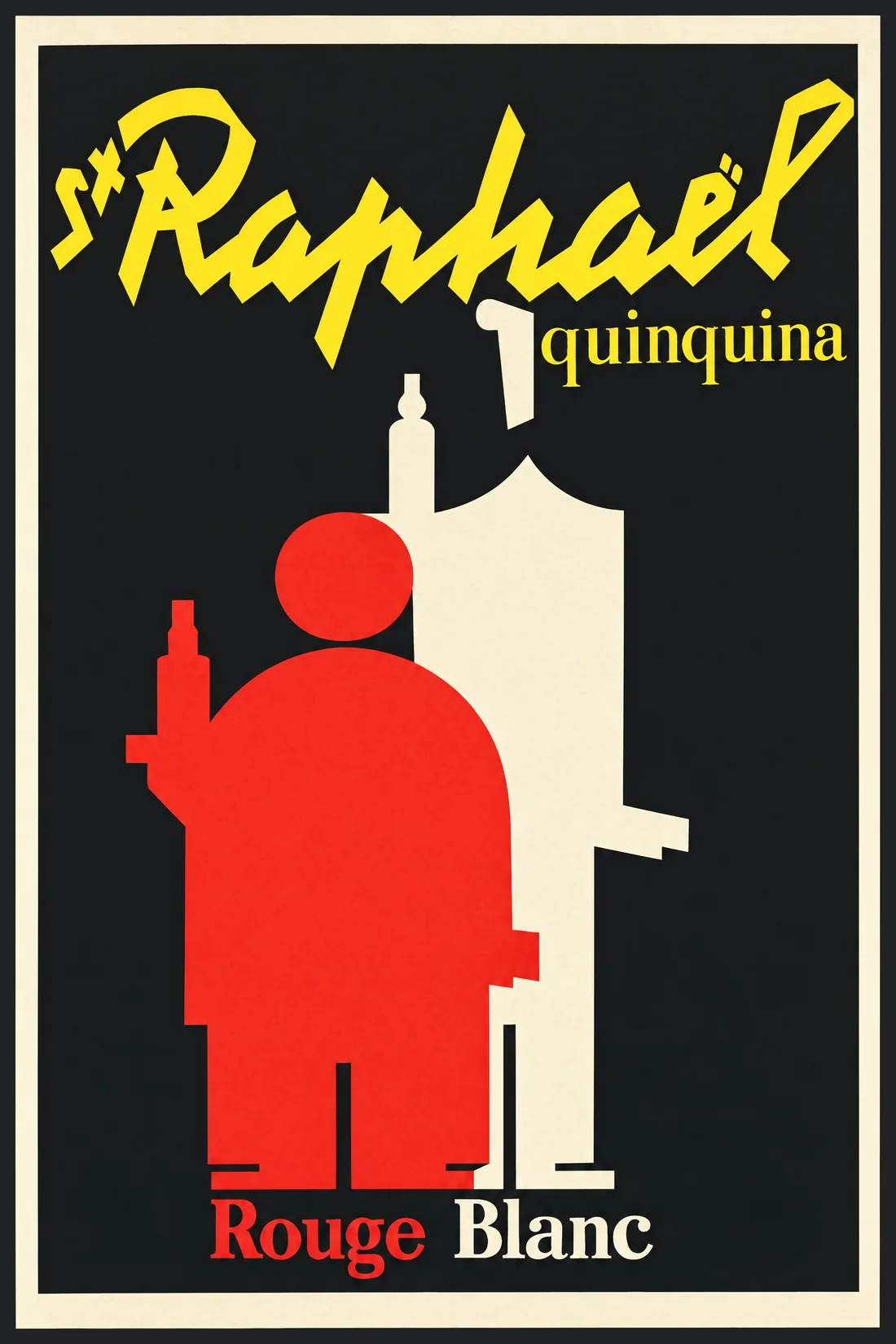
St Raphaël
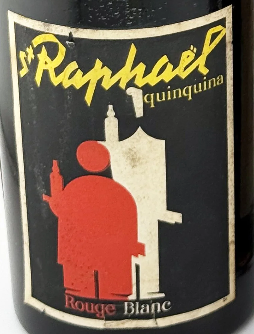
The label
- House
- Établissements Ed. Rozès
- Town
- Bordeaux
- Date
- circa 1940-1950
- Style
- Art Deco
- Printing
- 4 colours
Its distinctive traits
- Designed by Loupot
The label itself is the work of a great poster artist.
- Bulb Neck
The shape of the bottle the label was made for.
- Quinquina & Cap Corse
The product category assigned in the catalogue.
Its story
The label names neither house nor town: only St Raphaël, the word quinquina, and the two colours, Rouge and Blanc.
The two waiters appeared in the brand’s advertising in 1932, before Charles Loupot. He took them up from 1936 and reduced them, step by step, to geometric masses, rebuilding the lettering of the name as he went: he found his own pre-war lettering too unstable, “its lack of precise construction deformed it with every use”.
The collection holds both states of the design. On the other, almost identical St Raphaël bottle in the collection, the same two waiters walk in profile, faces and hands drawn, the name in capitals: the earlier, figurative version, which Loupot did not sign. Side by side, you see what he took away: the movement, the detail, the serifs. He kept only two masses, one red, one white.
The drawing of the waiters on this label is the one on a poster the brand presents as a 1953 work by Loupot, and its lettering is very closely related to it. The author of the whole design and the date of the printing are not established.
Sources : St Raphaël · Notre histoire ↗ · Musée des Arts décoratifs · Loupot ↗ · Alliance Graphique Internationale ↗ · Charles Loupot · the thirties ↗
From the bottle to the print
"label":
"LL-2233",
"catalogue": 96,
"chain":
"ethereum"
}
What the label says