Quina Monin
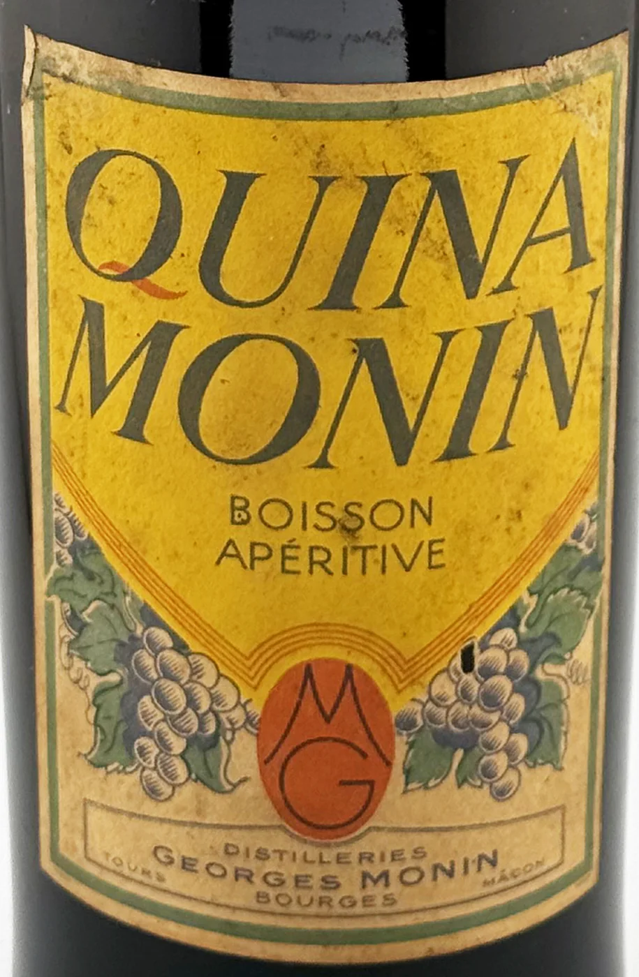
The label
- House
- Distilleries Georges Monin
- Town
- Bourges
- Date
- circa 1930-1940
- Style
- Art Deco
- Printing
- 4 colours
Its distinctive traits
- Vine & Grapes
Leaves and bunches drawn into the ornament.
- Burgundy & Berry
Dijon and its cassis (Lejay-Lagoute, Mugnier), and the two liqueur towns of Berry, Bourges and Saint-Amand-Montrond, home of Monin and Fournier-Demars.
- Quinquina & Cap Corse
The product category assigned in the catalogue.
Its story
The house account says Georges Monin founded his company at Bourges in 1912. Local history in Bourges dates to around 1924 his move to steam distilling.
The museums of Cognac keep a Georges Monin poster made in 1937 by A. Champuyer, with the slogan « Mieux que bien ».
Sources : (house account) Notre histoire — Monin ↗ · Monin — Roland Narboux, Bourges encyclopédie ↗ · Georges Monin — 998.9.8, Musées de Cognac (Alienor) ↗
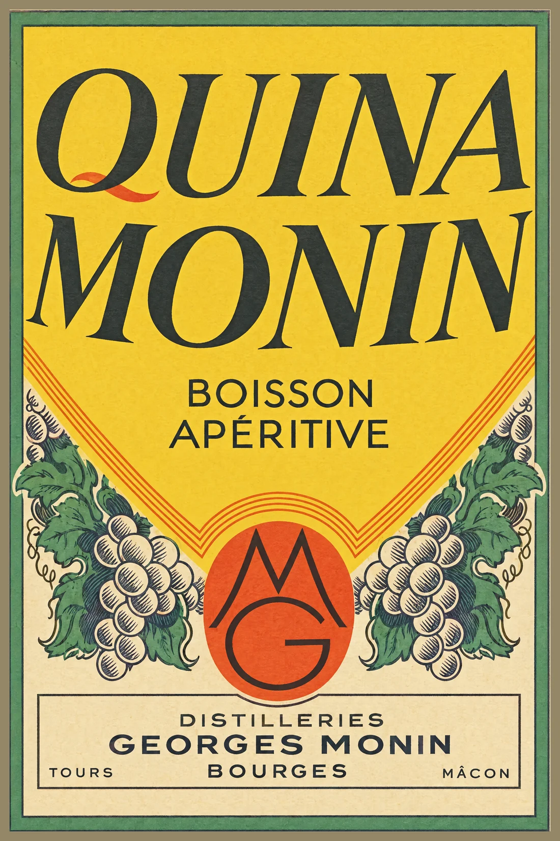
A red tail on the Q. The Q of QUINA ends in a separate red stroke, the only colour in the great italic title. Lower down, the yellow point, edged with orange lines, rests on an orange oval with the initials M and G stacked in fine black capitals.
From the bottle to the print
"label":
"LL-2242",
"catalogue": 427,
"chain":
"ethereum"
}
What the label says