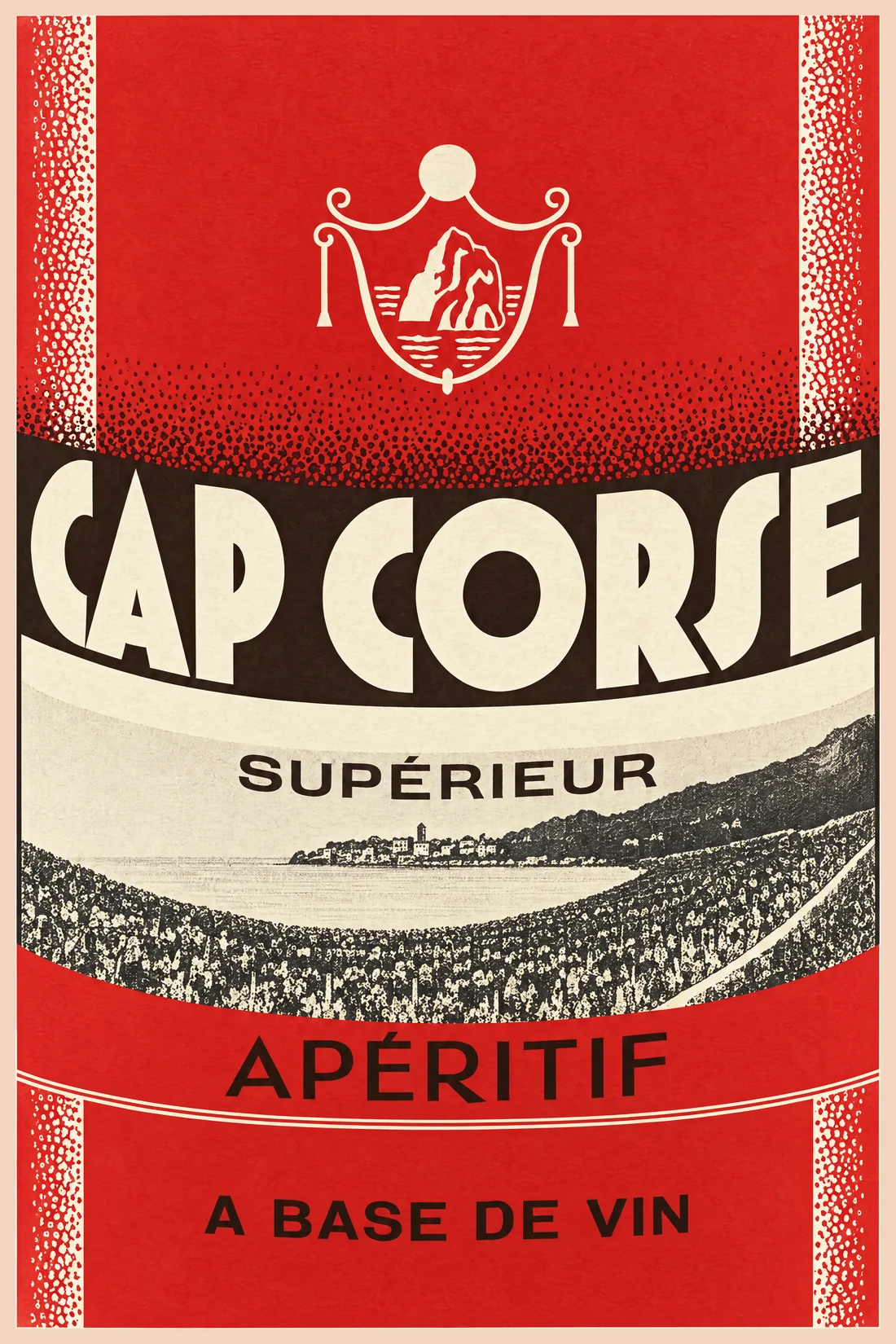
Cap Corse Supérieur
The label
- House
- Benoit Serres
- Town
- Valence-d’Agen
- Date
- circa 1940-1950
- Style
- Art Deco
- Printing
- 3 colours
Its distinctive traits
- Quinquina & Cap Corse
The product category assigned in the catalogue.
- Languedoc-Roussillon
The first region of the drop.
- Art Deco
The graphic style assigned after reviewing the remastered label.
Its story
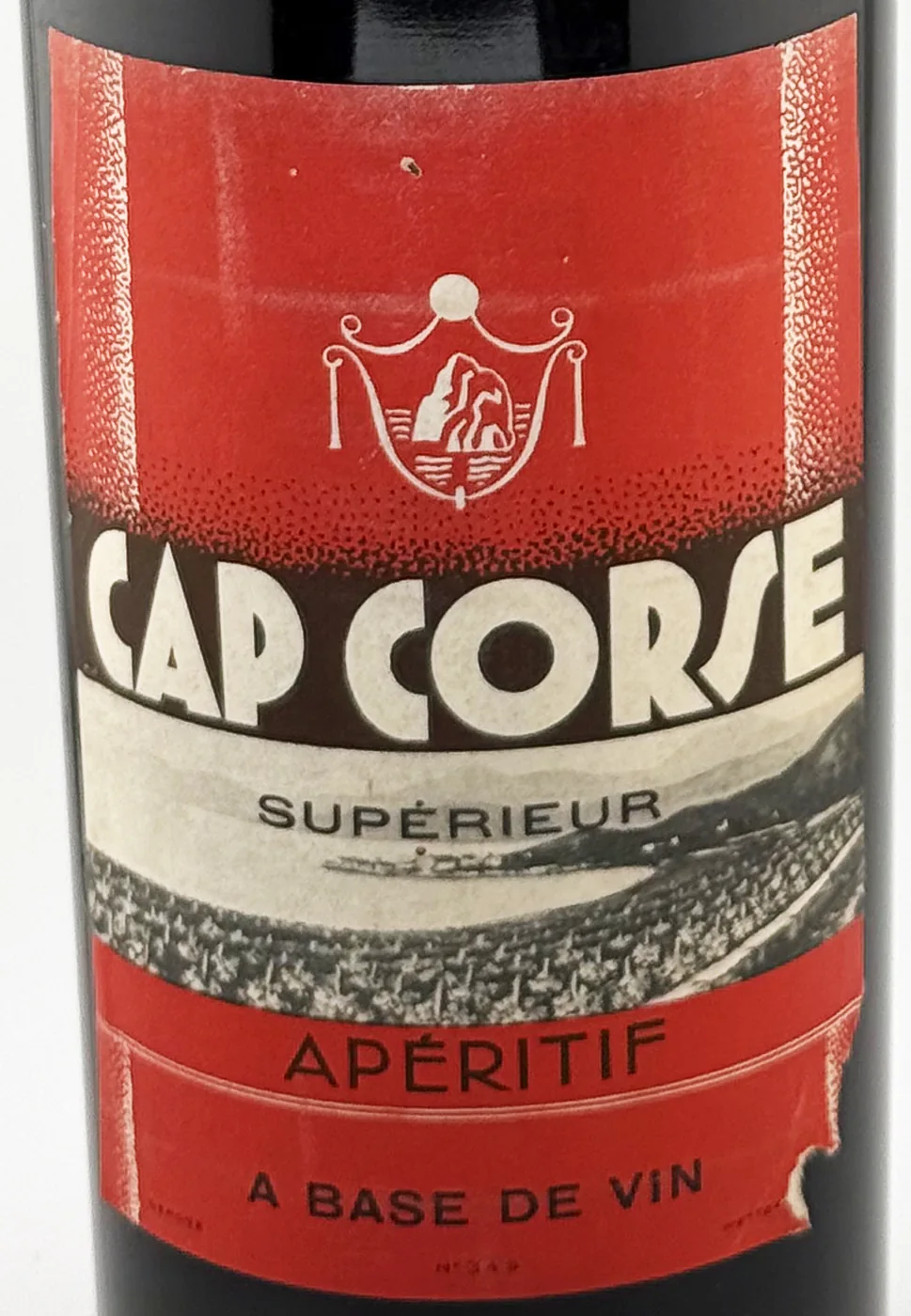
No outside source has been found yet for this house. The label records only its name, CAP CORSE SUPÉRIEUR, the crest and the coastal view.
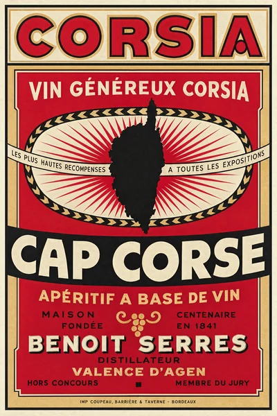
The inventory files it with Corsia (LL-2791), also in the register.
An S drawn like a tall long s. In CORSE the S is stretched into a tall, slanted stroke, an Art Deco flourish that makes the word look like CORſE. The crest above shows a rocky island on the sea under a sun, inside a draped cartouche.
From the bottle to the print
"label":
"LL-2806",
"catalogue": 919,
"chain":
"ethereum"
}
What the label says