Quina Sévigné
The label
- Date
- circa 1930-1940
- Style
- Art Deco
- Printing
- 4 colours
Its distinctive traits
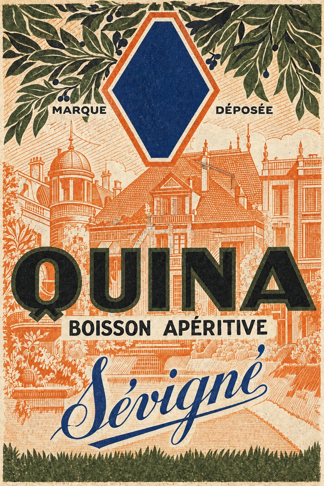
- Diagonal Title
The name set at an angle across the label, to catch the eye on a shelf.
- Quinquina & Cap Corse
The product category assigned in the catalogue.
- Art Deco
The graphic style assigned after reviewing the remastered label.
Its story
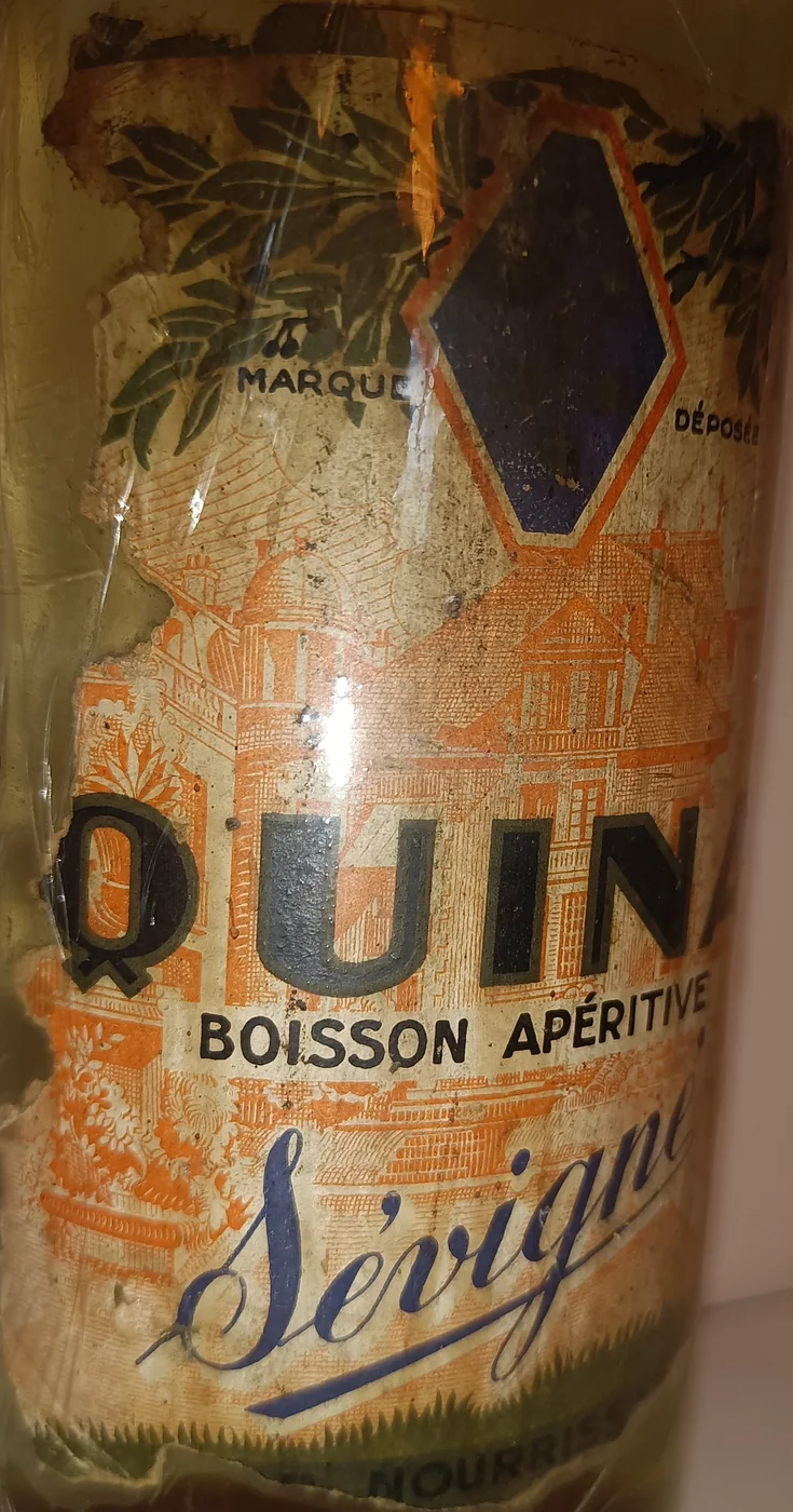
No outside source has been found yet for this house. The label records a registered mark, MARQUE DÉPOSÉE, and the name Sévigné in script; a dark band at the foot, now worn, carried a name that can no longer be read in full.
A whole town drawn in a single shade of orange. The background is a single-colour line drawing of roofs, terraces and trees, so the black and blue lettering sits on a lace of orange hatching. The blue lozenge at the top, framed in orange, is left empty.
From the bottle to the print
"label":
"LL-6003",
"catalogue": 658,
"chain":
"ethereum"
}
What the label says